No Options
Tutorial
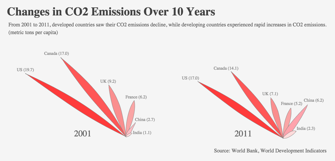
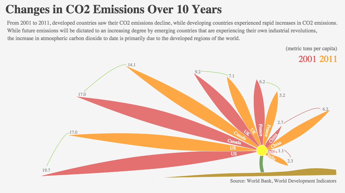
To support designers to create expressive information graphics, we provide a special kind of smart guides, dubbed “data-driven guides”, which is generated based on real data. In this tutorial, we will walk through the steps of how to work with the data guides to draw interesting information graphics. We will use 2001 & 2011 CO2 emission datasets (Table 1) and draw a leaf-like graph based on the datasets (Figure 1).
| US | Canada | UK | France | China | India | |
|---|---|---|---|---|---|---|
| 2001 | 19.7 | 17.0 | 9.2 | 6.2 | 2.7 | 1.1 |
| 2011 | 17.0 | 14.1 | 7.1 | 5.2 | 6.7 | 2.3 |
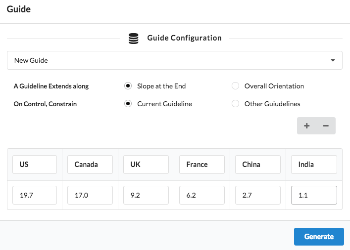
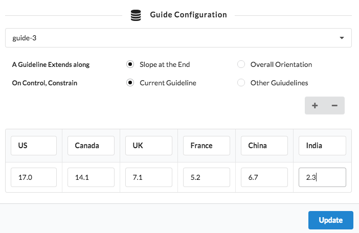
First, you put the 2001 CO2 emission dataset by clicking the Guide tool (Ctrl/⌘+7). Since the default number of columns is four, you should add two additional columns by clicking the plus sign. You then rename the columns and column values to match the dataset, and click “Generate” to create a data guide (Figure 2).
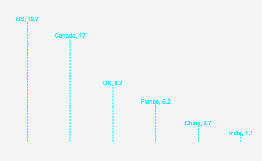
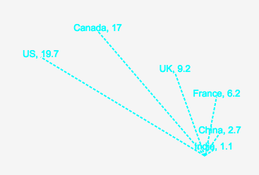
A data guide consists of a number of guidelines that correspond to the number of data points. Initially, the guide looks similar to a skeleton bar graph (Figure 3). Using the Select tool (Ctrl/⌘+1), you rotate & move each guideline to place them in a circular layout where the baselines of the guidelines are located at the same point (Figure 4). When you place the cursor over a data guide, tooltips appears to show corresponding data values at the tips of guidelines. If you think the data guide is too small, you can grab one of eight corners of the bounding box to scale the size of the guide. If you scale only a subset of the guidelines, the rest of the guidelines will automatically scale to maintain the relative lengths of all the guidelines.
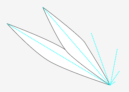
Now using the Pen tool (Ctrl/⌘+4), you draw a leaf on each guideline (Figure 5). While not necessary, you can lock the data guide by opening up the Layer panel and clicking the lock icon. This is useful to avoid unintentional selection and manipulation of a guideline while drawing on top of it. The pen tool also supports snapping a new anchor point to a guideline. More magnetic forces are exerted at the end points of a guideline, while less magnetic forces are applied along the stem of the guideline. The Pen tool is a lot like the Pen tool in Adobe Illustrator (link), whereas our pen tool has limited functionality compared to Illustrator’s Pen tool.
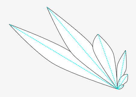
If you want to use conventional shapes, instead of free-form shapes of your own, you can use the Shape tool (Ctrl/⌘+6). It currently supports the creation of circles, squares, polygons, and stars. It provide various parameters to control their shapes such as the roundness of square corners, the number of sides in a polygon, and the number of points of a star. These shapes are basically preset paths which you can further manipulate using the Control tool (Ctrl/⌘+2).
To reshape the path of a leaf, you can use the control tool (Ctrl/⌘+2) to move a leaf, move its anchor points or adjust the handles of the anchor points (Figure 6). Pressing a shift key, while moving objects, anchor points, or handles, restricts the direction of movement into horizontal/vertical/diagonal directions. Similar to the pen tool, an anchor point is snapped to a guidelines based on the proximity of the distance between them.
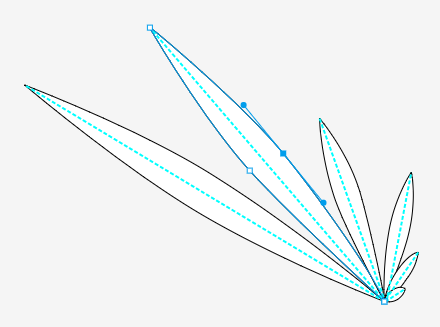
To control the manipulation of shapes and guides at a finer grained level, you can use the PanZoom tool (Ctrl/⌘+3) to pan, zoom-in (shift+click), or zoom-out (option+click) the whole canvas. To change colors, you can select shapes and open up the Color panel (Ctrl/⌘+8) to change their fill and stroke colors (Figure 7).
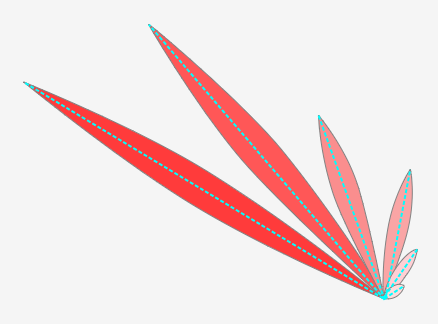
Once the initial drawing is done, you can start binding shapes to each guideline. To bind, select a guideline and a leaf shape, and click ‘Bind’ in the top menu bar. Similarly, you can also unlink them. When bound, you can control a guideline to manipulate bound shapes. That is, the guideline serves as a backbone controlling the bound shapes. For example, if you adjust a handle of a guideline, the shape of the bound leaf will adapt to the modified guideline (Figure 8). While we allow free-form manipulation of a guide, keep in mind that such manipulation should be done with care. Please take a look at the design guidelines that we put to shed light on some of best practices of designing information graphics (Tab: Design Guidelines).
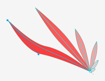
The binding feature is also useful when you need to update the underlying data. For instance, if you change the 2001 CO2 emission dataset to 2011 dataset, the lengths of the guidelines as well as their bound shapes adapt to the new dataset (Figure 9). We use a vector deformation technique to deform the bound shapes (paper 1, paper 2). However, the deformation technique does not always work as you expected, meaning that it may need secondary edits afterward.
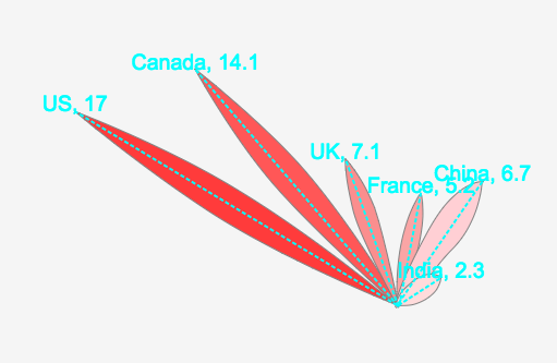
Finally, you can add a title and description to explain your graphics (Figure 10). Data labels are also important to clearly show exact data values, especially when there are no axes. These textual elements are crucial to help readers understand the message you hope to convey. They are particularly important in non-conventional charts to defeat graphical distortion and ambiguity. For more details, please refer to our design guidelines. The following is the final graphics.

And, here is another version (Figure 11). While one might argue that the datasets can be visualized more effectively in different representations such as conventional grouped bar chart or line chart, in this tutorial, we demonstrated the expressiveness of the tool enables authoring of more creative information graphics.
End
Design Guidelines
While we leave how to design up to the discretion of users, we highlight some of design guidelines from the data visualization literature.
High-level design guidelines
Low-level design guidelines
You don’t have to follow these principles in particular if you just want to draw data driven arts. However, the principles have been followed by many practitioners and shown effective in communicating information in a more trustful and credible way. It is still debatable which is the best way to design infographics though. In some cases, well-designed creative graphics outperform traditional charts in terms of drawing readers' attention as well as helping them memorize and recall information being conveyed. Above all, your design should follow the intended purpose of your graphics.
Reference
- [1] Beyond Memorability: Visualization Recognition and Recall. Borkin, M., Bylinskii, Z., Kim, N.W., Bainbridge C.M., Yeh, C.S., Borkin, D., Pfister, H., & Oliva, A. IEEE Transactions on Visualization and Computer Graphics (Proceedings of InfoVis 2015)
- [2] Tufte, Edward R., and P. R. Graves-Morris. The visual display of quantitative information. Vol. 2. No. 9. Cheshire, CT: Graphics press, 1983.
- [3] Doumont, Jean-Luc. "Trees, maps, and theorems." Brussels: Principiae (2009).
- [4] Pandey, Anshul Vikram, et al. "How Deceptive are Deceptive Visualizations?: An Empirical Analysis of Common Distortion Techniques." Proceedings of the ACM Conference on Human Factors in Computing Systems. 2015.
- [5] Aspect Ratio and Banking to 45 Degrees, Robert Kosara, accessed in Aug 11, 2015: https://eagereyes.org/basics/banking-45-degrees

